It’s been about a decade for me in the Media and Entertainment industry where I have been working as a Production Designer/ Set Decorator for feature films, television commercials, web series, music videos, print media etc.
I only got introduced to the world of sets and film making during an internship at Mtv India in 2008 where I was taken in assuming I am a fashion stylist, from a fashion college (NIFT – National Institute of Fashion Technology) – but Hey! No! Fashion Designing is another specialisation altogether and I was then getting a degree in the field of Communication Design. What I wanted was, to be a part of the brazen- faced image that Mtv stood for – I mean at one good time Mtv generated and defined visual culture on a global scale – and that is just what I wanted to be a part of, so I stayed.
We built sets that were more like 20 feet by 20 feet talk show stations – each VJ (Video Disc Jockey) had a set station for his/her act and that’s how the show’s platforms were defined visually. There were also spoofs, music videos, on air promos and a lot of brand advertising that came to the channel to be conceptualised and produced – so set’s were designed to repackage these ideas and commercial brands in the ‘Mtv’ sense of style and panache.
I didn’t know the term ‘production designer’ nor ‘set decorator’ then – we were art directors and assistants responsible for the sets and shoots, designed to incorporate the visual language of the channel, that was – popular culture – glamorous, inspirational and aspirational for the youth and subscribers of music.

Back in Mtv we were also a very small in-house team who handled most of the jobs, it was a factory – one set wall behind another turned around overnight for a 7am call everyday! – crazy amount of work done though!
I stepped out of the channel and then became a freelancer, worked on a couple of feature films, some shorts and various television commercials credited between titles of Art Director, Set Decorator, Set Dresser, Prop’s Sourcer, OnSet Art Supervisor, Art Researcher – within the Art Department hired by a Production House. As it happened, these job profiles were only getting recognised in the credit roll’s of production companies following international formats – otherwise we were always under the umbrella bracket of “setting” and “art” people and it’s just been like that until the recent past.
As a matter of fact – don’t we all just skip understanding specialisations of profession’s all the time? – like that of the Assistant Director’s (AD), where AD’s are mostly generalised – no one much wants to recognise the difference in job profiles of the DA (Directors assistant), 1st AD, 2nd AD and the 3rd or the 2nd’s 2nd AD. Orrrr the Camera Department – where there is a professional who’s skill is pulling camera focus only, there are camera operators, the grips team and then the lighting team with a gaffer being the chief lighting technician – all working under the creative head that is the Director of Photography.
I find myself guilty here too and hate to admit it but sometimes its been easier to say that I make sets for Bollywood films instead of explaining my role as a professional, a production designer, in the art of film making. I often resort to telling people that I am glorified carpenter! – But more than the intended pun, I found myself struggling between the many intertwined fields and questioning my knowledge in these fields – architecture, interiors, styling, décor; mechanics, robotics, weaponry; landscaping and lighting; study of eras, styles of periods etc etc… – Its overwhelming!
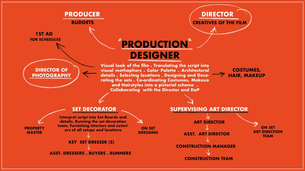
It’s overlapping as well, more so when the whole concept of ‘Production design’ has been a fairly new one to the country. The art department itself has a significant crew strength, often the largest, and there are many departments within the art department – under its creative head that is the production designer who further has two departmental heads; there is an art director and his/her team of drafting, construction, painting and executing supervisors; and a set decorator and her/his team of dressers, buyers, prop makers, runners; sometimes various art directors and set decorators working on separate sets for the same project. There are visual and concept artist, graphic designers, ageing experts, sculptors, location scouters, vehicle coordinators, special effects engineers, post production supervisors; and then there are many many collaborations with other professionals, specialists, historians, services etc.
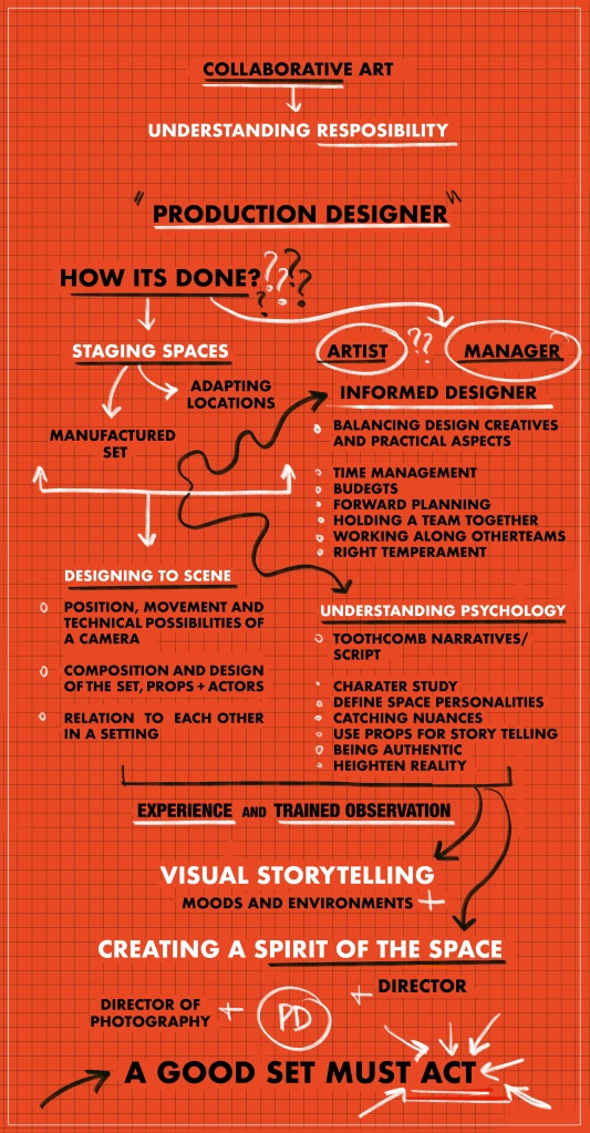
The process of film making, is a collaborative art, each person, each team responsible for specifics within the project and within their departments, and of-course there is a detailed process followed that can be further explained as per each project but what needs to be understood foremost is the responsibility of one’s role within the profession – to most effectively understand what the job profile entails.
*Disclaimer: Its a patient read and a long one – please take your time going through all the 4 parts, I would have written down a book though its easier to scroll down 😉
Production Design(er)
A production designer is a key creative who is responsible for the overall visual look of the production.
In its fullest definition – this extends to translating the script into visual metaphors, creating a colour palette, establishing architectural and period details, selecting locations, designing and decorating sets, coordinating costume design, hair and makeup into a pictorial scheme and collaborating with the director and director of photography to define how the film should be conceived and photographed
Source: By Design – Interviews with Film Production Designers by Vincent LoBrutto
- Manufacturing a Set or
- Adapting a location

What is considered as a manufactured set and the best how we know it – is seeing through your designs from sketch to its final product.


Sketches above are of Bombay Velvet Club, from the design board of the film Bombay Velvet, combining the styles of Art Deco and Art Nuevo – inspired by cinema’s of the time.
The images followed below the sketches are what the setups finally turned out to be – there is exaggerated use of gold and glitz reflecting Karan Balraj’s (main protagonist) attraction towards having the lifestyle of a big shot!
This is just a basic example to illustrate what comes under the category of manufactured or constructed sets – interior and exterior. Key note here is to notice that the interior built didn’t require a fully finished ceiling and what we did with the exterior facade was only to build and dress to a couple of floors – the remaining of the structure left to be extended on post production.
Now, what I mean by – Adapting to a location is finding a shell or a skeleton base to build on the conceptualised look and/ or a basic idea, making most of what a location can offer to stage the scene.
Choosing and locking locations comes under the production designer’s call even though there is a locations department scouting for locations and who also manage the logistics involved to film in the selected location.


The above images are of a set staged on location – a home study. We used only around an 8’/8′ area within a huge bunglow in Bandra, taking advantage of the existing window frame set inside a perfect corner.
This was part of 7/8 montages for a 30 second Discovery Commercial where we tucked in all the set ups within the bunglow premises in cozy nooks, creating layers with background foreground dressing and minimum construction. It was all much faster to create, cost effective, logistically friendly to have all shots taken inside one space and basically set to serve the purpose of the script – there wasn’t a need to build from scratch.
Adapting locations to realise look boards is something that is done all the time and then of course comes shooting city scapes, streets and exteriors, where the art department might just have to organise a few props or do surface changes.
Nonetheless, what we also mastered in the bargain was – how to go back to the same locations and treat them differently. And I might have a good example to explain the same as below.


Image on top is the corridor of a closed down Hospital in Bombay, I have gone back to this location quite a few times for its Victorian charms, high ceilings and a great flooring!
The first time we hired the location was to set up mood for a Calcutta House Veranda – we added in browns by scraping down oil paint off the door’s and polishing all the wood; added new window frames to match the existing louvered door ways, repainted the walls that soaked up paint in layers, giving a quaint texture to the walls and then we retained the flooring just by giving it a good wash.
The same location was also used to set up a passage to an Army Ball Room. I wanted to ‘up’ the look – so added wooden panelling and flooring; windows were replaced having a classic style framework with fluted glass sandwiched in between; walls were surfaced with a self textured wallpaper and then the set was dressed incorporating many reflective dressing details like using brass, hanging a chandelier, drapes of velvet curtains, glossing the leather in furnishings etc.
Something interesting to note between the two sets is the illusion of height achieved – by simply controlling the length of drapes – same space feels homely than the grandiose other. Both these sets were executed months apart and they are two different projects altogether, advantage only of using some of the homework from the previous job – floor plans, measurements and basic logistics to the location.

I am going to derail a little bit and vocalise the job pressures a bit – Time on floor, which here means on location, prior to shoot was 2 and 3 days respectively. Reduced time on locations due to a good chunk of allotted budget going towards hiring the location and if truth be told, many of the sets that I have worked on have shaped up under ten days time – from getting the script in hand to the shoot day. On longer formats, like that of a film, one might get a larger prep time though it involves pre-planning on a different scale to accommodate months of shooting sets and locations together.
In-fact, effectively, any production design team is hired only after there is a script or a draft script in place. It is also one of the first teams to get on board of a production, nonetheless there are crunched timelines between the project going green to the urgency of broadcasting the same – one is always racing against time and to date it amazes me how the department gets to the finish line. As a hilarious anecdote once a colleague mentioned in an interview – that what we, the art department was actually required to do is “visualisation on cocaine and interiors on speed” – many might relate – for creating the look and mood comes far easier than getting logistics together to meet the stages of principal photography.

This often posts another question always in my head – are we artists or managers?? Jack of all trades and masters in putting together all the trades in hand huh!? – definitely a conclusion that I came to if anyone asked me how I managed this and that within a given time frame – albeit I still called myself a glorified carpenter!
In actuality of todays time – An effective designer is one who can balance the creative and practical aspects of the job, be an artist and a manager at same time. There is a correct temperament required to be able to work in a practical filming format, breaking down the script, working along various departments, holding a team together, surpassing time pressures, allocating budgets to prioritise spends, and within all of this to finally realise the true vision. I believe that every job has brought a massive addition to my own know how, I have learnt to understand lensing and filming ratios very recently and wood toning and some painting techniques even more recently. Honestly, then or now, if you don’t know, you just don’t but if you are really really looking for it, there is no dearth of information out there. One needs to become more of an informed designer. My thoughts too were put to perspective after reading a whole lot of interviews with some of the greatest production designers of the time. One from Robert Boyle made it so clear, he says
“You have to take skills you collect along the way and adapt them to the whole collaborative art of film making, which is dependent upon one thing – the script
and We are to create a total physical environment that interprets the script. What you are doing is designing spaces for action, that’s what we are really trying to do”
The struggle has been real – Don’t get caught in the battle of skills. It’s important to be educated in the field of art, architecture, interiors, design – it’ll be great and definitely to ones advantage to have skills to support your visions but not always necessary to hold them all.
What is really important is understanding the psychology of the screenplay and then creating physical environments, adding your expertise in this creation and running the show as imagined. What I am trying to get to is that it’s not about painting a pretty picture or having to design grand interiors – that’s where one goes wrong, that’s really not the job, grandiose may be a part of the design concept but that isn’t just it – the responsibilities extend further – to be able to convince viewers that the world of film is undeniably real – constructed, adapted or found. Therefore in the following explanations I wouldn’t emphasis on the working of hands but minds, the thought process one needs to enhance to be able to be a good designer.

Part 2 : Designing for the scenes
In theory – we are to design for the scene and invent a reality for the audience. Therefore – manufactured set or adapted location, for staging any scene it’s essential to work on spaces understanding the following:
- the position, movement and technical possibilities of the camera
- the composition and design of the set, placement of props and actors
- their relation to each other in the setting


In the images above, a 60 second TVC done for PepsiCo. – what you see is the widest frame decided, we therefore built parts of the facade of only two structures to a pre decided height and width according to what will be finally captured on screen; windows dressed for look throughs and street lanes covered just about that much, to set the feel of a London street corner garage in a 1950’s – mimicking the character of Charlie Chaplin. There is use of foregrounding elements to create the needed depth and props like the truck stationed to block everything else behind and on the sides.
Unfortunately due to time constraints not every job can be designed in such precision or have a story board to support the action – in all such cases there is a fear of the set running out! We therefore often build and dress to maximum capacity after discussing possibilities with the technical heads, incase there is a need for a lens change or improvisation of action.
On the other hand, location shoots can be a dangerous open canvas, however if planned ahead, always helps in controlling the overall mood of the film. This can be categorised in something we we call as dressing a live location.


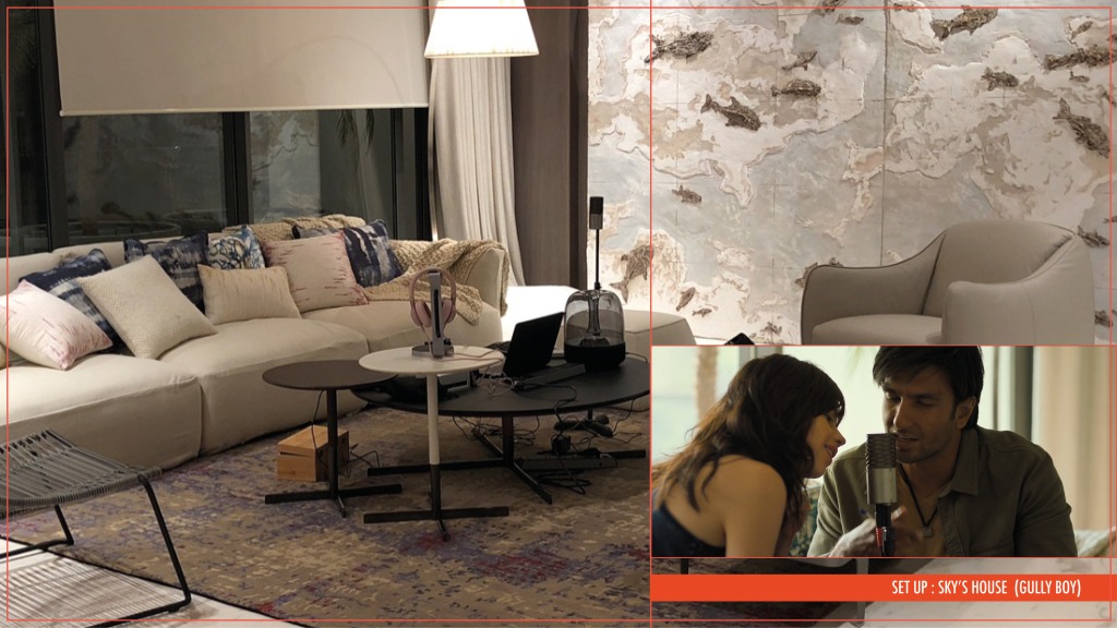
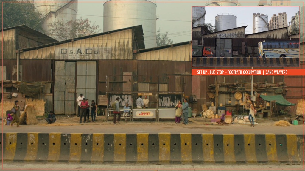
Image above has some quick notes from a fairly straightforward location scout – listed better on my breakdown sheet, from the Film: Gully Boy, Set: Bus Stop(s). We had to build a couple of bus stops as understood from the script; it wasn’t permitted to shoot on existing bus stops as that would result in blocking traffic and creating chaos; renting from prop houses wasn’t an option either for we wanted to weld out the back open, hence the structures were constructed to have control over the size and style, altered to fit to the selected locations – all planned and designed according to action.
Please note that on the scout we had mapped out the route of our protagonist completely, which helped to work out necessary requirements. Additionally the on set art team were always given covers like canvases, gunny cloth, used bedsheets, vehicle covers etc to conceal any unwanted object or colour along with background extra’s prop’s.
- Two base bus stop : To indicate a lesser population boarding and alighting buses – not much of a main junction as compared to Murad’s bus stop that was placed on a main road
- Fixed in the centre of the the lane : to create proximity to the walking path and have an explicit depth of field
- Open Back : unblocking view of the lane and daily pursuits of the area
- Dressing within the pathway : to establish routine and time of the day – freshly baked buns, rush for office and school goers etc
- Hand Props : character essentials always on them, handbags, mobile phone, ear plug etc
- Fixed Bus Stop Dressing : reduced to minimum and ignored from the advertisers, except worn down local job pamphlets
What we achieved even in this small part of the film is to establish a geography, highlight morning routine, further showcase daily commotions, affirmed a socio economic status while retaining the location charms of the old mumbai town – all staged to a marked pathway and taking advantage of the bread baker located in between.

Sometimes even smallest of small – like a puddle (slide above) is created for the camera to be able to capture the desired shot. And just like that, one can’t really afford to wait for a leaf falling from the tree and when a gun fires away we need to study and exhibit the impact of the missed bullets on various materials – plaster, wood, metal, glass, paper; often exaggerate the impact to register the emotion. Additionally if all the shot taking is not in coordination – there are resets planned and props kept in extra to rebuild. Material studies and product building are opening filming making to horizons never reached before – visual effects further supporting the process. But just getting back at the ground levels and incase I am missing to convey the idea of what staging means – ever wonder how a small room inside a slum could accommodate all the cast, crew, shooting camera, lights, sound equipment??? and all the other jazz??
Dear everyone – IT IS A SET UP! – a created world whose settings are completely illusionary — unapologetically man made and staged – almost always. Every facet is designed to suit a scene for the characters – how they are to move in a space and how they are required to interact with their surroundings – be it for 10 seconds or 10 hours – We create all of this and that to visually tell the story envisioned by the director and shot cinematically – therefore along with director and cinematographer, a production designer marries the film’s screenplay to a manufactured set or adapted location – bringing a vision to life.

Part 3: Understanding Character Psychology | Creating Personalities through Spaces
Now who are we Staging Spaces and Designing Scenes for?? – It’s for the characters in the story, characters who we want the audience to resonate with, purely because more an audience believes in the authenticity of the characters more convinced they will be of the story. This is the reason why I mentioned earlier that responsibilities are larger than finishing a set build, meaning –
We are supposed to create settings for actors to rightly fit into their characters and in which an audience can emotionally invest – everything that the audience don’t think about when they watch a film – the job is to create the spirit of the space. This can be thunder storms or silent waters, war zones or kingdoms, futuristic fictions or comic book situations, habitats of man or animal, theories to a club or notorieties of a cartel.
We need to speak through objects, textures, forms, colours and tones, creating moods – where we don’t want you to just see space but instead hear, smell, taste and feel it – experience the story.
In-fact – In films and spaces of imagination, interiors and buildings are to become settings that have a psychological meaning. They are to act as metaphors for the story line – we therefore need to create personalities through spaces.
Nowwwww what is interesting is that every character is a different story to tell and every situation can be treated in a specific way so every space has a chance to have its own unique interaction. And therefore knowing unknowingly – in my many years of working in the art department there hasn’t been any space that has had the same look – simply put, no living room has been similar to the other for the following reasons :
- Firstly because the narratives to design are specific
- Second that every character is a story in itself
- These combined, help in defining unique personalities to all connected spaces
- Then there is always greed to make spaces feel different from one another
- And finally in all the authenticity of the created environment, further blended in and loosely called is – “cinematic liberty” – to give a punch to the real, stylise it and eradicate all the dullness.
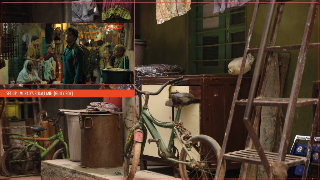
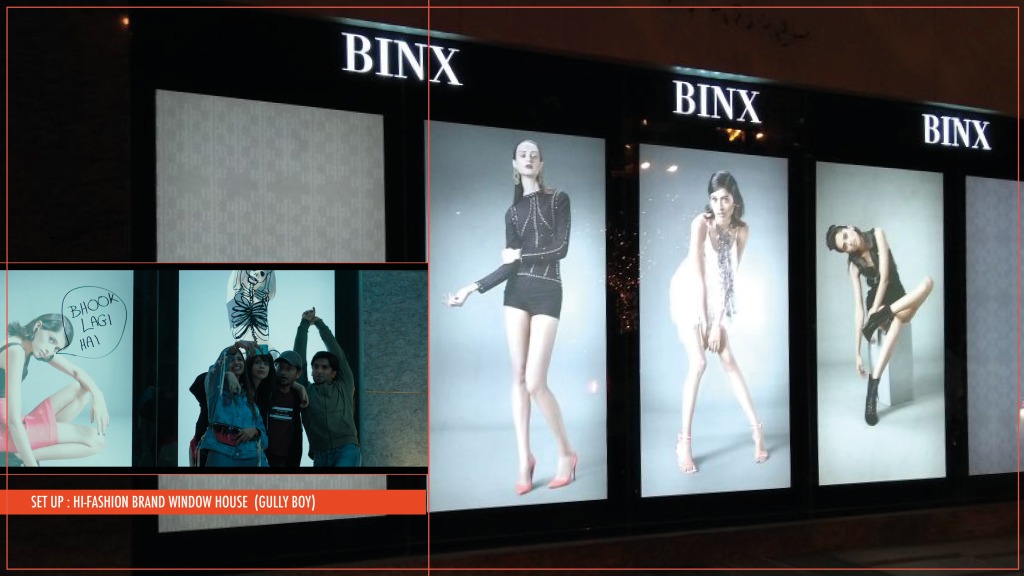
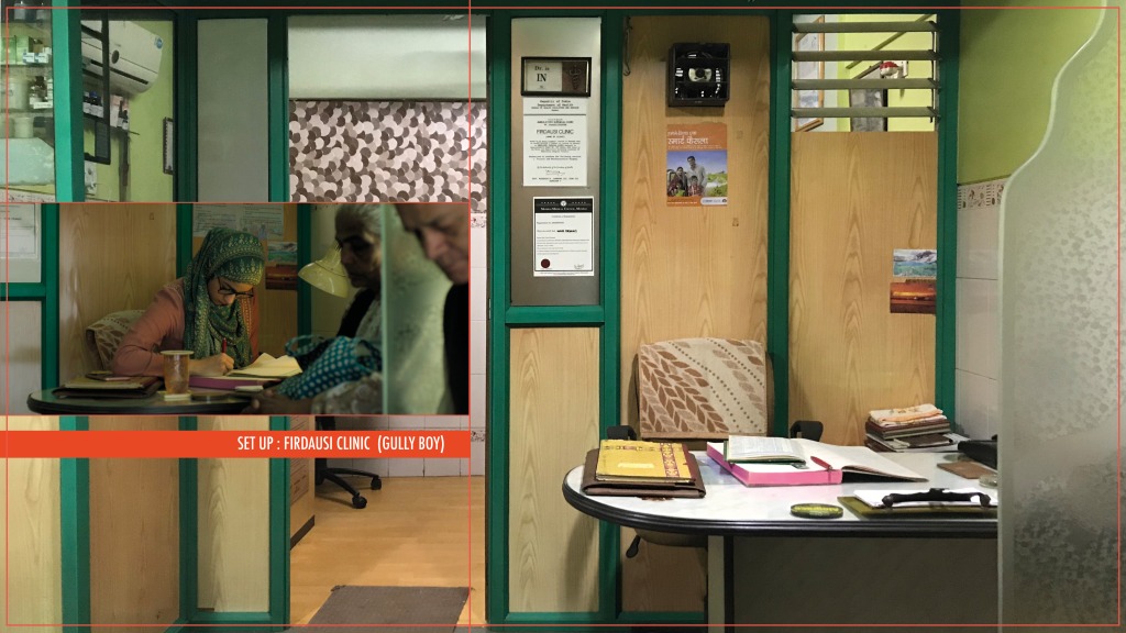
Let’s get one thing out of the way first up – The concept of being AUTHENTIC and with it bringing REALITY to any space, with a film that had an India takeover connecting with masses – Gully Boy

Depicting reality has rarely got recognised in the Indian context of production design where only larger scaled sets of a production receive accolades. I was the set decorator on the film Gully Boy, directed by Zoya Akhtar and designed by Suzanne Caplan Merwanji. I like to believe that the art team got their biggest compliments on this job, for no one seemed to recognise that the slum was a set built, nor any other set up designed to scenes. Ummmmm – yeah pretty much that’s what I like to believe but I am seldom modest, I never leave a chance to show-off all the work that went behind holding the film’s visual story seamlessly. Be as it may, filming isn’t ‘pick camera and shoot’ especially when a production design team is rightly hired to support all narrative.
Even though I would want to take you through the entire process, I will only be able to give some glimpses through this post – to understand the concept of being authentic in the reality of all sub cultures showcased, looking closely through selective viewpoints, and with these how in the film’s visual storytelling a genuine ‘reality’ was ‘heightened’. In the slides below I have complied some images of colour pallets and frames from the film for a quick look through.


#FunFact1 is we didn’t use the colour ‘blue’ in the film nor went near the waters of Bombay. I mean – its Bombay! – Queens Necklace is Bombay, Worli Sea link is Bombay – the blue tarp covered blocks that we see first thing landing on the airport, all the slums, housing and buildings taking cover from the monsoon showers in the city – these are the visuals symbolic to Bombay. Nonetheless, these were eliminated.
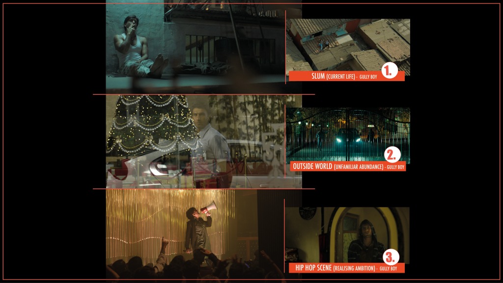
Director Zoya Akthar and Production Designer Suzanne Merwanji wanted to see and showcase the city only from Murad’s (key protagonist) eyes and the world’s he inhabits, which is
- The Slum where he lives — hangouts with friends and moments with girlfriend Safeena;
- The world outside — which he is unfamiliar with, a world of glamour, money and abundance; and
- The underground hip-hop scene where he gradually realises his ambitions


What we wanted to achieve, was to break away from how Bombay is perceived, not have a viewpoint of an outsider but look at the city from the daily hustle of an insider. Additionally, we didn’t want any visuals to over shout or break away from the characters in the film, yet emote as much. The nucleus of this was to knit the film together through a colour pallet – sans cobalt blue. Softer hues of the colour blue were used of-course but none otherwise.
There was a lot to visually voice out – claustrophobia, struggle, distrust, betrayal, violence, power, privilege along with, love, passion, strength, loyalty, hope, happiness, ambition and freedom. And hence, apart from having a very conscious colour pallet, locations were worked on that were socialist modern in architecture – chosen for their brutal geometry; there was persistence use of caging and boxing of spaces – depicting life in confinements; and each frame controlled by developing moods even in the harsh lifestyles of the varied income groups depicted throughout the film. No waters and less sky was to control the idea of space and freedom in Murad’s life and opened up with the transformation he goes through. No blue – coz we liked green better! More so, we wanted to defy tradition – and the blue tarp seemed very disturbing – tell me if you missed it!?


I find it dull to do a room as it is. I feel as a designer your function is to give a reality to the public that is real but departs from the dullness which is very often part of the actual place.
It is nearly always a heightened reality – Stylization” – Ken Adams
These words from Production Designer Ken Adams sum up how we as a design team function principally, depict a reality for the audience that is authentic yet departing from the dullness of the actual. There are psychological messages always running in the background and setups worked out as per the intended mood and the reality of its characters – all designed to fit. Therefore, both communication and visual communication within all creative minds throughout the prep and principal photography needs to be very sharp. The connect with the director’s vision is just as such, and the design discipline followed through is sometimes amazing – on the film scout, the two – Zoya and Suzanne, travelling in separate cars spotted just the same location shells, exterior facades, streets and lanes, to then work all the magic!
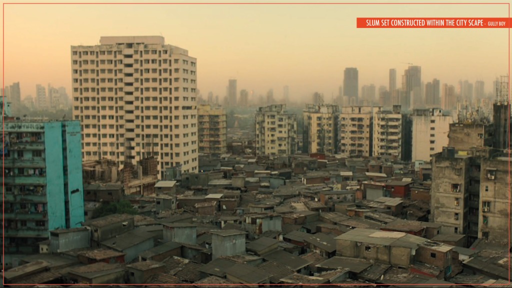
#FunFact2 – there was a tremendous effort that went into convincing the producers to build the slum set within a parking lot inside Dharavi itself, amidst different levels of living that we wanted to see and show the audience without actually pointing it out. Such environments, ingrained architecture, organic housing, varied societies, with a backdrop of high rises of the city – something we didn’t want to risk being created by any kind of visual effects by building inside studio grounds with green screen around. I am truly fortunate to have witnessed and be a part of this journey – for all the very conscious visual decisions taken and methodology followed.


Character Building : Identify | Research |Explore | Reason
The thing is, not everything is written down in a script – There are time’s one gets to collaborate with directors who have very strong ideas of what they want to see and express to the audience, other times they are more driven by actor performance and written narrative and give you a freer hand. Between any of these, the art department makes further backstories of people and spaces, breakdown individual character stories adding a personalised layer to the treatment of the film.
We have not lived the lives of the character spaces we build so it’s essential to keep exploring, finding answers and reasoning them. I have never repaired a car in my life, let alone change a tyre, or be stationed in Siachen on duty but made sets for all. I ask a lot of questions, I try and develop various viewpoints within each set up to do – what would I do if in the same situation? What are the properties that identify with the story of the characters?
LOOK AT IT FROM your EYES – put yourself in that shoe – what would you do if in the same situation and what would you want or expect around you?
LOOK AT IT FROM EYES OF THE CHARACTER – research the style, behaviour, patterns in routine and lifestyle of the intended person or people and know about the social, economical and political situation of the time.
LOOK AT IT FROM WHAT YOU WANT THE AUDIENCE TO RECOGNISE -the play of feelings and emotions – transporting the audience to conscious or subconscious manifested experiences – anger, anxiety, awe, awkwardness, boredom, calmness, confusion, disgust, fear, horror, joy, nostalgia, romance, sadness, satisfaction, surprise….

When I started work on the film ‘Tumhari Sulu‘ directed by Suresh Triveni, Sulu (main protagonist), her world’s were bounded by her family alone and limited exposure to life outside. Ashok, Sulochana and son Pranav Dubey’s day to day family story juggling between home, work, school, society, some joyous moments and some bittersweet struggles – as homogenous as any of our own.

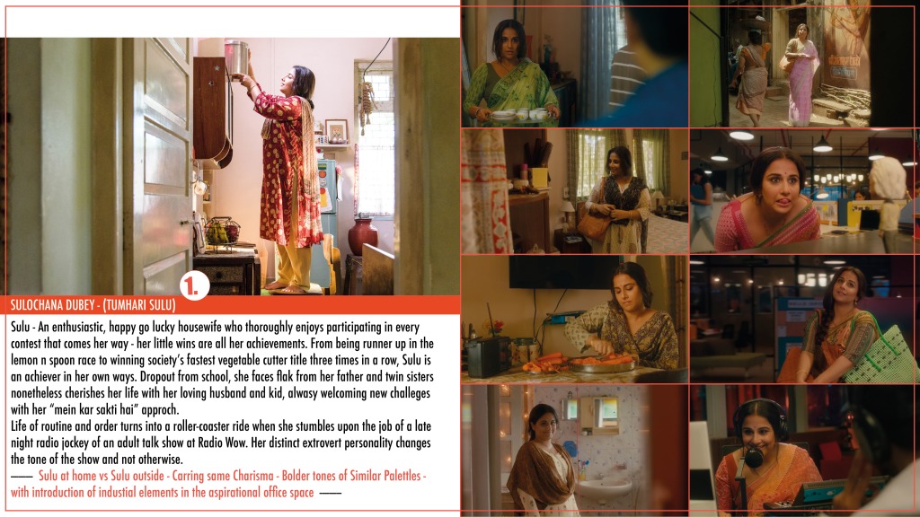
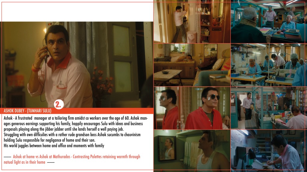

The most important setup was their house unquestionably – also a major section to the film. I always looked at the house to be the pivot point bringing each one of them back to a safe ground from whatever their interactions to the outside life shaped as. A middle class household in the outskirts of Bombay, where the family accepts happiness in little packages along with struggles of establishing their places in the finite world outside. For Ashok, his life is home to Mathuradas & Son’s, his office; for Pranav – its home to Love & Faith, his school; though for Sulu its home to her “Main kar Sakti hai” (I can do it) attitude, her will to achieve anything if given a chance. These are chances she is willing to take against all odds, always thinking of ideas, looking out for challenges, contest announcements, society events, competitions, races, games – any plausible way to overcome her under educated self and to prove herself for the better of what a house wife status brings in the world as we know it. These are her little ‘claim to fame’, her achievements in providing for their home.
Suresh wanted this world of Sulu to have ‘goodness’ in ‘reality’ and reflect ‘honesty’ in ‘struggle’s’. This was the only brief and it was only through this viewpoint that every space and every character throughout the film was treated. In any dull moment there was surely a coming of light. The visual character treatments also belonged to this school of thought – a brief character sketch of their personalities and interactions with their home to the second lived spaces are complied in the slides above.
Every aspect in the film, from naming the school “Love and Faith” senior secondary school; having the 60+ staff dress mannequins at Mathuradas & Sons, and welcoming of Sulu to Radio “WoW” were included in finding an honest goodness feeling. The treatment to the house was as such as well – a place for everything and everything in its place albeit the smaller area, understanding each of the resident’s lifestyle and needs. One bedroom apartment with Pranav sleeping on a sofa cum bed and the 3’/3′ dining table turning into his study. Order within everyday chaos, a day run from habits and schedules. Privileged with sunlight coming in throughout the house though not with an extra amount to have their house painted or have their tv replaced. House walls aged down but not any stale water seeping in, mismatched furniture bought over a period of time one by one, slowly but surely putting together a home within their own capacities and aspiring for a better living. And within the changes of the characters and the story line – a house “in order” becomes a “neglected” one and back. Slides below showcase how we made small interior changes and dressed an an empty apartment bringing in the characters live inside.


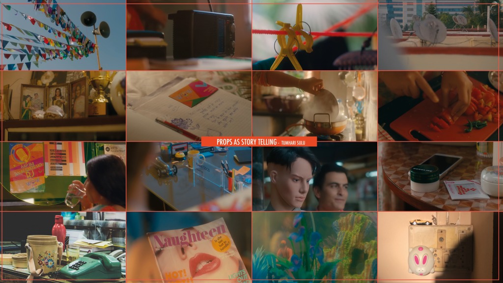
Understanding these very characters, everyday life objects were used for storytelling, to speak about the simplicity in life – as simple as notes inside a hisab (accounts) dairy, waving flags, tiffin dabba’s (boxes), mosquito repellant, hot water bag, chopping board – everyday life objects, simple daily items of use – but objects which spoke a language connecting you and I.
Research, Identify and Characterise: pattens in routine and lifestyle; social, economic and political situations of the time; nuances in style and behaviour; individuality of each character – these are some key points that help in broadening the way of looking at everything – for simply
- There is a difference between how a prostitute lives compared to how a prostitute with a child lives.
- The house of a rich notorious gangster and the house of a rich businessman turned politician.
- Poor who lives under a bridge and the one who lives on a footpath
Looking closely one will understand how differences in lifestyles and eating habits and sleeping hours etc aid to create differences in their spaces. These are observations one probably can’t learn in theory but have to sometimes step out and study them. I took a stroll down our city exploring ways of living down under the poverty line, visuals that hit me very hard. I am not even sure if this is the right example to put down, its not a pretty picture, but what I saw wasn’t just poverty struck livelihoods but great fights in survival methods.


The families had build their homes on raised platforms – fighting rat scare. They held their makeshift homes together by using empty buckets and tin cans filled with sand as foundation stones, sometimes empty oil cans as platforms too. Collected and assembled pieces of plywood and brick, layered beddings and sheets providing some comfort; using cloth lines as separators, and discarded flexes (printed advertisement hoarding mediums) giving their homes shade and cover. One thing that made me cheerful was seeing toys that the kids made for themselves, using soda bottles, tin cans, shredded cloth pieces, bottle caps, jute strings…etc. Disparities are as harsh as they appear and its heartbreaking, but what I want to point out is that there is always a sense of structure that people bring into their living and that is what one needs to take and incorporate.
I find it most difficult to dress a lower middle-class house and even more difficult to explain why the family should have a packed kitchen with everything and anything needed to serve first the family, the extended family and then guests. Or have a double door fridge and a flat screen tv. There are always arguments on affordability and priorities. But it is just what it is – go down rural areas or small-town houses – a kitchen will always be a packed one – utensils after all have been the first gifts to the bride and groom, and electronics – need of the hour.
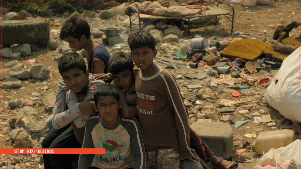
These are important facts that help bringing reality to empty spaces, making them lived in and helping the actors getting into correct environments. Images below are a few set ups done in the film Gully Boy for the song ‘Doori‘, of under the poverty line living – building on and dressing over some very well scouted locations.


Now lets get to the other side of character building – giving personalities to spaces itself
Remember I mentioned everything is so intertwined – it is – and that’s the beauty of the process – with every job one’s horizons open up and visions mature – I never get bored, its just extremely hectic sometime! Anyway, one of the most difficult locations to crack down in the film Gully Boy was the defunct mill – where Murad witnesses the whole underground rap scene booming, images followed below. Now this space was to be an escape place – could really have been anything, basically kids making use of an abandoned area as their own dugout. But we were little stuck here as ‘underground scenes’ are often shown as vandalised properties with sprayed graffiti all over – which is utter bullshit when it comes to the Indian context – we don’t have ghetto style scenes or an 8 Mile culture – in reality spray cans are also an expensive tool of expression, “ma man – can’t afford that shit”. It’s a pre-set vision and more of a reason for us to define a character to the place itself – staying true to the Indian context.

Suzanne was adamant that the location department help us find a genuine deserted spot, though due to logistical reasons of filming we were left with the only option of a worn down factory used by shooting crews from all over – and therefore ripped off its original charisma.
We fortunately got hold of some earlier scout images of the factory floors – Golden Tobacco Company where Panama used to be manufactured and distributed in the 70’s and 80’s. These images were only from when the company shut down, empty shells but looked gorgeous with all the oil painted ocher beautifully aged with time. Thats where the idea of its treatment was born – somewhere imaginative as an accounting and operations section of the factory. The entire floor was refurbished, we built a mezzanine, counters for cash dealings, sectioned wooden cabins, added fixed and moving furniture and bundles of rotten files, paperwork, computers to establish an 80’s style office – pillars and dado were repainted to its original for glazed surfaces give more depth to any place – absorb and bounce light in a way making it come to life. Only after, we had some surfaces with scribbled notes, art on dusted glass, and hints of hand-painted graffiti.


An empty location treated with period charms, retaining what could be its original character – run down and neglected with time though mobbed with styles of its new callers. So Rightly – One man’s junk becomes the other’s treasure. A simple treatment of having build character to the space itself.

Honestly I don’t look at anything like you do, I try to see the nuances of what a space or its characters have to offer and adjust everything else to what the scripted scene needs to emote therefore automatically giving a specific identity to a space, overriding pre-set visions and help in visually defining every scene in a newer manner.
It’s the trained observation and character questioning that helps the entire team detail and be able to treat every character and hence every space in a different manner – to blend in or break out from what is perceived yet sticking to its reality or give absolutely new identities to the world’s one wants to create.
Further more you develop Taste.
“Taste is the solidification of your knowledge about any given thing at that time” When you think about a movie in the broadest sense – where its shot, the locations, the big scene, the small scene, about how people live – you are saying “I want this in the movie, not that” – Richard Sylbert
Source: By Design – Interviews with Film Production Designers by Vincent LoBrutto
This couldn’t be more true! It takes a little time and disciple to get here, therefore I often advice students to come and work on some projects – just to observe and unlatch blocked visions, to understand this intertwined world that we create, to look closely and get in tune with judgements, perceptions, temperaments and decision making capacities. With developed taste over a period of time one just knows what to have on set and what to lose – sometimes knowing what not to does the trick better – and this comes with experience.
THE PROCESS and recap
It’s a big team that one is a part of, to work forward and always be on the same page – it’s important to be able to translate your vision that is understood by all. Pre-production period is where all the romance happens – we incorporate all of what I have jibber- jabbered so far into look books that the whole team follows like a bible – it mentions scene numbers and time period to be staged on a set, knowing the light of the day the scene is scheduled in the script – dawn, morning, evening, night; location notes, key references, sketches and plans, supporting graphics etc. When on floor and running between various location – its execution time holding this one docket between the team. Giving one small and last example of what one of set page of a docket looks like below –

Conclusion: A film set in order to be a good set – MUST ACT
A good set – must act, whether realistic or expressionist, modern or ancient, it must play its part. – and that’s all it needs to be doing.
So there is this last point I am trying to consciously incorporate – To NOT to put my personal greed over what the script demands
Earlier I wanted everything to show on screen – specially sourced props or the scale of the setups and get quite agitated if not seen to the full and be blurred in the background. But I have grown wiser 😉 I understand my role better. I don’t really want you to notice my work – I want you to be invested in watching the story we all want to tell.
If your eyes didn’t go to the set behind – my job was well done then – we did manage to blend the characters reality to a staged world. The setup played its part being the background, supporting its actor – and its role was to be background support only but when the settings had to speak the story – they were the only hero, everything else acting as a supporting cast – there is just no other play.