You know how teachers and professors at schools and colleges always feed you with rot that everyone is competition and one must beware of even their own shadow!!! I thank my stars (actually my parents) and the people I met that mattered, because of who I got to believe in just the opposite – to be fearless! And as much as I wish every one to work carefree with just all the passion and nothing else …… she truly is fearless – KIMYA GANDHI – my inspiration from the day I have known her!!!
I call her fearless for she pursued what she really liked, studied and experienced the world around it and is now willing to share her theoretical and practical understanding of the subject in design schools and in her work that speaks for itself. Well well…… Kimya Gandhi is a freelance typeface designer with a passionate interest in Indic type design and the only technically sound one that I know off. She has designed typefaces in Devanagari and Roman scripts and one can also approach her for projects in Print and Publication Design and Ethnographic Research.
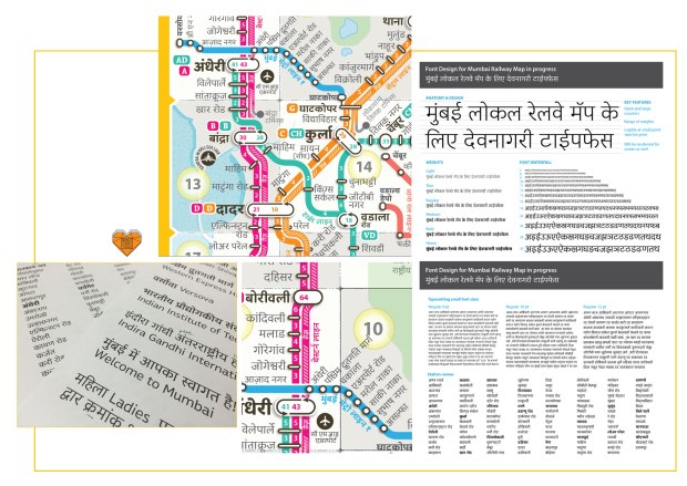
If you are an everyday local train traveller in Mumbai and you follow the Mumbai Rail Map then its the font “raah” by Kimya, designed in the finest of the font weights and sizes that helps one in an even easier navigation of the otherwise very well designed map by Jaikishan Patel and Snehal Patil. I always feel that the detail in design often goes unnoticed, but if missing – the detail, it is just pinned down to disdain. Font design in a wholesome falls in this category. In India its a bigger challenge for we still don’t realise the difference the correct or wrong usage of a type makes. For me if this map had the traditional script then there was no way all station names and other information were well readable and understood on an A5 print size!
There is a sanskrit phrase that translates to ‘From the formless arises form’. It means that the form is decided by its function or concept. Good and bad are relative terms. I would say judging a typeface depends on many factors. A good typeface does justice to its concept and works well in a scenario it was designed for. I personally like typefaces that have been designed with careful attention to detail, that combine aesthetics and function effectively – Kimya Gandhi (extract from a interview on Linotype)
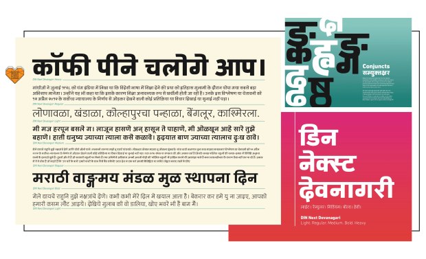
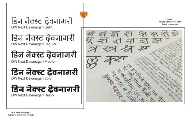
One of Kimya’s first works that straight affirmed her career option of type design is the development of the DIN Next Devanagari font for Linotype GmbH, Germany. Makes me really happy that this one chose to stay put in her country for the available infrastructure and said attitudes of the industry to type design have not yet matured to its full. It is in-fact a difficult one, type design and typography, because it needs much patience, discipline and technical knowhow. While one thinks he/she knows it all – even to start reading and understanding what each term in the profession means is being on a roller coaster…. I suggest to once just google/ wikipedia font, type, typefaces, typography to actually understand the depths of each within…….. All I would say is they make or break the meaning of a visual or an identity – The Font.
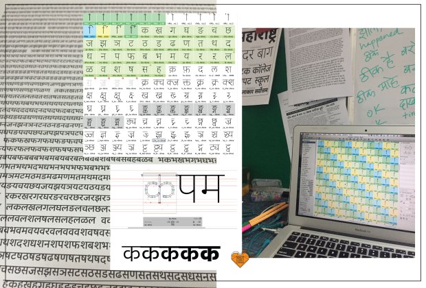
In the collage above you can also see snippets of the font “Maku” in progress, a handwritten font inspired from Kimya’s own handwriting and images from her desk. I remember many times asking her to write captions on my college assignments, so glad it could be used by all – soon soon!
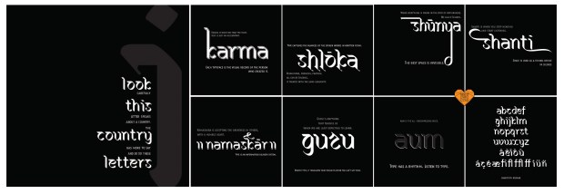
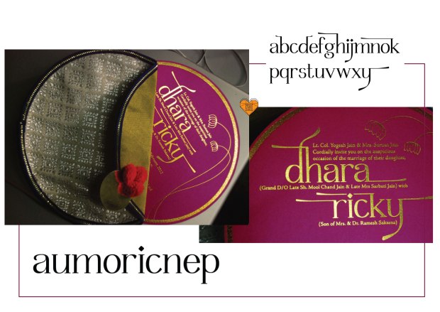
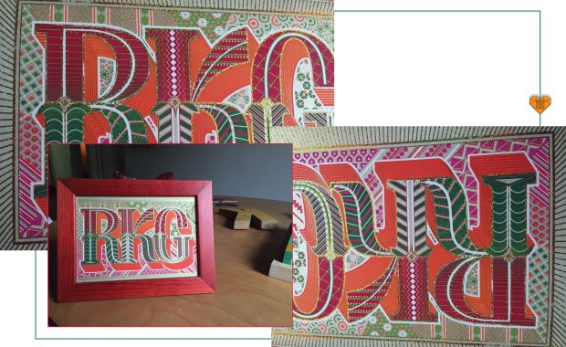
And now the best part of this post – the font “Deej” inspired by meeeeeeeee for my wedding card. How cool is that right!? What can I say…….. one of the happiest moments of my life!!! So to all my credit Ms. Gandhi has also been taking up projects to design many many wedding invites including her own ‘RKG’, all using various methods of printing, screen printing, lazer cutting, foil stamping and embossing. Contact her now!!!!!
So much so – Kimya is a treasure of a talent and has a lifetime of production for her creatives 😉 She has worked for and with the kids, penned down articles for various publications and lectures in some of the renowned design colleges. The snapshots of her work definitely speak of a thousand words and the photographs she captures even more…… Oh! not to forget, this year Jan she got married to one of the finest type designer and a wonderful being – Robert Keller – who profoundly shifted base from Germany and has come down to work in the Indian setting. Their new base is at their home office in Ville Parle……
Heard or already follow MotaItalic ?!? You now should……..
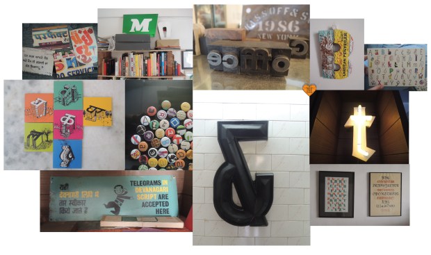
Images from the house of Rob and Kimya………. a typo heaven!!!!
P.S. This post has been the most difficult one.. for its not just her creative end that I want to boast about but our friendship for about 10 years and growing that I am very proud of.
There are so many things to be said, told, expressed and communicated. The variety of messages demand variety in type - Kimya Gandhi


